Dark Greens? New Blues? The Trending Interior Paint Colors of 2019
Is 2019 the year you will buckle down and repaint your house? Good idea! Whether your home is blank or your paint colors are outdated, a bucket of paint makes the biggest difference in your interior design.
But interior paint offers more than just aesthetics. The right colors will make or break your home. Certain colors give a room a specific feeling, can accent a wall, and can even be used to spice up your furniture.
This is why you should choose some trending paint colors for your repainting. And you don’t want to be so last year, right?
So which colors are in and which colors are out? Here are the trending interior paint colors of 2019.
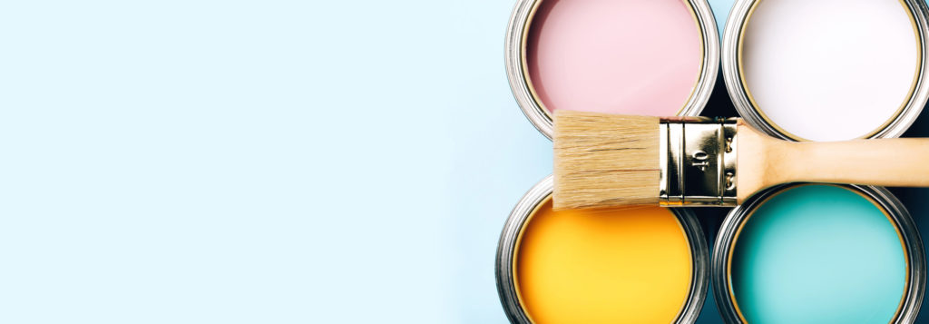
Trending Interior Paint Colors You Will Love
Color is powerful enough to make the biggest impact. Don’t go to the paint store ill-prepared! Choose one of these paint colors for your home.
Lilac Gray
Gray is a classic color for the interior. But classic gray can be a little bland. That’s why more gray-shaded options are available this year. A popular one is lilac gray.
This gray offers lilac undertones, making it an attractive shade for walls. The lilac boost helps make a room look a little more cheery and exciting. However, both are cool shades, helping you feel relaxed.
It’s easy to use lilac gray in any room. The living and dining rooms are the perfect rooms for lilac gray. But it also looks lovely in a bedroom.
Hazelnut
If you prefer interior neutral shades, opt for hazelnut.
Just like the delicious nut, hazelnut is a warm brown shade. What gives hazelnut its warmth are the subtle yellow and orange undertones. This makes hazelnut a diverse shade to use in all rooms.
Pastels
Yes, we know what you’re thinking. Pastels in your interior design, really? As long as they’re toned down, they make any room look stunning. Pastels are very soothing.
Combining a classic pastel with a neutral helps amp up a minimalist room without giving the room an Easter egg appearance.
Keep in mind, pastels shouldn’t be used in every room. The best options are the bedroom, especially for a child. The worst option is the kitchen.
However, pastels do make an attractive accent wall and can be used for furniture. If you do want to use pastels in the kitchen, use them for furniture such as your kitchen cabinets.
Muted blue and green pastels will look lovely in a traditional white kitchen. Click here for more.
Dark Green
Do you want to use color in your interior design but want to avoid the pastels? Dark green is a trending color this year. This color is also called “night watch.” It’s a classic hunter green, but a few shades darker.
The darker color decreases the intensity of traditional hunter green. In addition, it makes a room look a little more grim and moody. This is why you should proceed with caution when using hunter green.
If you prefer bright rooms, you’ll want to think twice about this color. But if you prefer darker and grim rooms, this color will bring out that aesthetic.
Blue
Blue has always been a popular choice for many rooms. But which shades of blue are trending for 2019? Ice blue, charcoal blue, pale powdery blue and blue-gray are the blues you should use this year.
In short, subtle and cool blues are what’s in. Ice blue and pale blue will be striking while blue-gray is more subtle.
What should you avoid? Blues that are too loud and intense. Examples include cerulean, cyan, navy blue, royal blue, azure, teal, and cobalt blue. However, these blues look great on your furniture (just not your walls).
Soft Clay
Every year, there’s a revolutionary color that changes the design world. This year, that color is soft clay.
Look of a traditional neutral, such as beige and brown. Then think of that mixed in with a salmon pink and orange color.
The result is a neutral with a touch of pink that looks extremely elegant. The salmon shade helps make a room look warm but the neutrals help tone down the intensity.
Using soft clay in your home is easy. It looks lovely on the walls, especially for rooms such as the living room. You’ll likely see furniture and décor pieces in this shade, as well.
Mist
Another 2019 revolutionary color is mist. Mist is wonderful because it combines two interior color trends already mentioned on this list! Taking the pastel trend, mist is a pastel blue/green shade mixed with the lilac gray color.
Using mist in your home is easy. The color is very soothing, so it works perfectly in the living room and even in the bathroom.
Mustard
Yes, that burnt yellow color we all hate seeing on cars is actually a trending interior shade. But proceed with caution when using mustard in your interior design. Mustard works best as an accent color.
Use mustard for your wall, door and window trim. It also looks beautiful as an accent wall. You’ll likely find plenty of furniture and décor pieces in this mustard color.
If you want to use mustard for a whole room, make sure it’s muted. Combine mustard paint with a neutral such as beige.
Pewter
As mentioned previously, gray is a color that can easily look bland. The secret is choosing the right shade of gray.
Pewter is a great example of gray that looks rich. Pewter is a blend of gray and beige. While the color is simple, it can quickly transform any room.
Pewter is great to use for all rooms. Use pewter for the living room, dining room, bedroom and bathroom walls.
Are You Preparing to Sell Your Home?
Are you redesigning your home to sell? If so, you’ll definitely want to keep these trending interior paint colors in mind. That’s because certain colors are more attractive to buyers.
Here are the best paint colors when selling your house, for both the interior and exterior.